Archive for the ‘Science’ tag
A Virus Walks Into A Bar
This is a science blog, somehow. This is a great science video:
via 3quarksdaily
Regression 101 (SD line, statistics)
It is not a hidden fact that I work in geostatistics. More specific, I try to use copulas to model fields of spatially distributed parameters by mathematically describing their dependence structure. I set out to shed some light into what this all means, or what I understand of it, by writing a series of blog posts on planetwater.org.
In this first post I am going to try and explain a very basic tool of traditional statistics: regression. In future posts I am going to try and explain more topics with the goal to describe how copulas can work in spatial statistics. Today, I am going to use the classic Galton data-set of pairwise measurements of the heights of 1078 fathers and their sons. In the next post I am trying to show some of these concept using some current meteorological data.
Granted, some aspects of the analysis are adapted based on the classic book “Statistics” by Freedman.
Here’s what wikipedia has to say about the Galton data-set:
Pearson was instrumental in the development of this theory. One of his classic data sets (originally collected by Galton) involves the regression of sons’ height upon that of their fathers’.
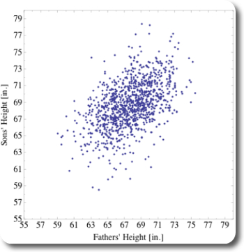
The data for this post was taken from this server at Berkeley, a similar analysis as presented here can be found in this pdf by Michael Wichura. A scatterplot of these pairs of measurements is shown on Figure 1, showing the fathers’ heights along the x-axis, and the corresponding sons’ heights along the y-axis.

Figure 1: Scatterplot of Galton's data-set
Figure 1 shows that the measured humans were around 68 inches tall, which is the range of heights where most dots in the scatterplot occur. The point-cloud is not circular shaped but like an ellipse, pointing toward the top right. Hence, on average, within the measured population, the taller the fathers are, the taller are their sons.
Fair enough, generally, tall fathers have tall sons. But are the sons taller than the fathers? If yes, then by how much? To answer this question, let’s look a bit closer, beginning at some basic measures of descriptive statistics, then let’s look at some classic regression analysis results.
Descriptive Statistics
The few results of some basic calculations of data-analysis are presented in Table 1. Those results prove in little more detail what we have seen by the first glimpse on Figure 1:
- fathers and sons actually are around 68 inches tall
- on average, sons tend to be a little (0.99 inches) taller than their fathers.
| mean | std. dev. | min | max | |
|---|---|---|---|---|
| fathers | 67.69 | 2.74 | 59.00 | 75.43 |
| sons | 68.68 | 2.81 | 58.51 | 78.36 |
Note that the range for sons (19.85 inches) is bigger than for fathers (16.43 inches).
Regression
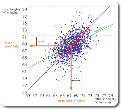
For the upcoming analysis, let’s call sons’ hight y and fathers’ heights x. Figure 3 summarizes the key results. A classic linear regression line is shown in solid blue and solid green. Both lines are identical, the difference here is that the blue line is calculated by an intrinsic function in Mathematica; the green line is numerically calculated:
$$ r = \frac{s_{xy}}{s_{x} s_{y}}\ m = \frac{s_{xz}}{s_{x}^{2}} $$
where $$r$$ is the correlation coefficient and it has a value of 0.51; $$s_{xy}$$ the covariance and $$s_{x}$$ and $$s_{y}$$ the standard deviations of x and y, respectively. The equation for the regression line is then given by:
$$ y = 0.51 \cdot x + 33.89 $$
Both the green and the blue line go through the point $$( \bar{x}, \bar{y} ) $$. Its slope m can be calculated by combining the first two equations:
$$ m = r \cdot \frac{S_{y}}{S_{x}} $$
Figure 3 shows a third solid line, coloured in red, which is pointing into a similar direction as the green/blue line and which is also going through $$( \bar{x}, \bar{y} ) $$. However, the slope of the red line is with 0.98 very close to 1.0. The calculation of the slope of the red line is very similar to the procedure for the green/blue line, except that Sign(r) is taken instead of r. Even more, $$s_{x} \sim s_{y}$$, resulting in a slope of about 1.0. The red line is also called “SD line” because it goes through multiples of the standard deviations away from the mean, both for x and y.
Now, what really is the difference between both lines? The fathers who are one standard deviation above the average fathers’ height are plotted on the orange dashed line. Similarly, the sons who are one standard deviation above average sons’ height are plotted on the yellow dashed lines. Both dashed lines intersect as expected on the red SD line. However, most of the points along the orange dashed line are below the yellow dashed line (see also Figure 3). In other words, most of the sons whose fathers were one standard deviation above average fathers height were quite a bit smaller than than one standard deviation above average sons’ height. This is where the correlation r of ~0.5 comes in place. Associated with an increase of one standard deviation in fathers’ height is an increase of only 0.5 standard deviations of sons’ height, on average. That point is exactly where the green solid line intersects the orange dashed line, on the regression line. This also means that for an r of about 1, the SDLine and the regression line would be identical.

Figure 2: Classical regression line and SDline shown on the scatterplot fo Figure 1.
Let’s try and shed some more light into the relation between r, the regression line, and the SDline. Let’s pretend we are moving along the orange dashed line in Figure 2 and while we’re moving, we count how many dots we pass and what the corresponding y value is. When we’re done we plot the “collected” data on a histogram, shown on Figure 3. It turns out, that about half the points we encounter are below 70.1, indicated by the green line. 70.1 is the value of the regression line at 1SD to the right of $$ \bar{x}$$. The intersection with the regression line occurs at ~71.5, which is $$ r \cdot s_{y} $$ higher than 70.1.
![Histogram along x=1SD to the right of mean[x] histogram along a line indicated by 1SD to the right of the mean of the x-values (dashed orange line). The dashed line and the orange line indicate the locations where the regression line (green) and the SDline (red) intersect with the dashed orange line](http://www.planetwater.org/wp-content/images/Galton_Histogram.jpg)
Histogram parallel to the y-axis of Figure 2, along a line indicated by 1SD to the right of the mean of the x-values (dashed orange line). The dashed line and the orange line indicate the locations where the regression line (green) and the SDline (red) intersect with the dashed orange line
Conclusion
The regression line is a linear least squares fit to your data. As Freedman puts it: “Among all lines, the regression line for y on x makes the smallest root mean square error in predicting y from x”. For each change of one SD in x direction, the regression line changes in y direction by $$ r * s_{y} $$. The SDline can be used as a different summary statistics of the scatterplot.
It remains to point out
- that the concept of regression works only for linear relationships!
- that under all circumstances you should think first very carefully, if the two variables that you are using for regression are the ones that are really related!
In the next post, I will do a very similar analysis with some real meteorological data. You can access the mathematica v.7 notebook that I used for this post here.
Jacob Bear Short Course – Day 4
The course is over. Instead of blogging immediately about day 4, I spent the evening in Torino and hung out with some people from the course. At this point I have to point out how nice the city of Torino is, how nice and willing to help the people are. In the town, during the days of my visit, I was asked at least three independent times, if I needed help! On the final evening, we sat down on a bench on one of the plazas, and an elderly man started to talk to us in Italian, slowly and very well understandably. He ended up walking with us through the old city four over an hour and pointed out places of interest. It was just wonderful!
On the last day we covered heat transport and transport with fluids of variable density, especially sea water intrusion. From a historical point of view it’s interesting that because of sea water intrusion, density dependent models were the first “contamination” models to be developed. That is before dispersion was developed, and hence sea water intrusion was treated with sharp interfaces. We learned about the “Hele Shaw Model“, which Jacob Bear has used to model sea water intrusion before the use of computers was feasible. Bear developed during his M.Sc. thesis a horizontal Hele Shaw model. His first bookhas a full section on constructing Hele Shaw models. The idea seems from a former time, but such a model could have its uses for education!
In the afternoon, Dr. Rajandrea Sethi gave a presentation on how his group models colloid- and nano-particle transport under saturated conditions.
These were just amazing four days in Torino. It was such an interesting approach – to hear essentially a short but complete version of porous media theory in four days. Jacob Bear as teacher for this short course was amazing. Every word he uses has a meaning, everything he says builds up consecutively, and he stresses the important points. I will have many ideas to write about in the next little while for sure! 🙂
Measuring
Observing and measuring occurrences in nature is the basis for any science, and is the basis for any engineering related to nature. Environmental engineering is very much related to nature. The problem with measurements is that they take time and are expensive. Nevertheless, every model used for prediction/forecasting needs to be calibrated on relevant and significant data. In some middle scale this is an ok task, say measuring the relevant parameters for a gasoline spill from a gas station is feasible. However, things get very complicated on both sides of that scale: moving towards the pore scale, or towards a capture zone, a watershed, or even bigger (maybe global) scale makes things even more difficult. Some questions that might arise include: How do you measure something at a pore scale? Has anybody ever measured groundwater velocity? Really? How do you measure hydraulic conductivity and which value do you put into a groundwater model? How do you access/store the collected data if you need to collect data on a global scale? I could go on…
If a time-component needs to be included, managing what data needs or should be gathered and managing the gathered data can get out of hands, even with today’s fairly sophisticated data managing and analysis tools.
Maintaining a measurement network is a difficult task, but initiating a measurement network something completely different. Sometimes however it happens that somebody or a group of people have the foresight to measure something, or to start to measure something, and the result is an incredible data-set: the tritium isotope data-set started 1952 in Ottawa, Canada, or the measurements of CO2 on Mauna Loa in Hawaii by Charles Keeling starting in 1958. How cool are those data-sets?
Special Issue of “Nature”

Nature has a special issue on ‘earth observation’. I think all articles are important — here are a few interesting thoughts:
The editorial “Patcing Together a World View” sets the stage: It points out how important measurements are, that they make us see things in a different way. He also addresses computers with geographic information systems as the tools that enable us to pull all the gathered data together
The creation of these new ways of seeing the world would be a significant aesthetic achievement even if they had no commercial, scientific or strategic use. In fact they have all three — as well as an even greater environmental usefulness.
Alexandra Witze points in her article “Not Enough Eyes on the Prize”, that often the same things are measured by different agencies, or different countries, funneling funds away from other new measurements. She also points to the problem of measuring things in new (“exciting”) ways with new techniques versus the needs for operational measurements on a regular basis
Declan Buttler paints in his article “The Planetary Panopticon” a picture of real-time monitoring everywhere on earth. This requires instruments/satellites, computers, and still, a lot of money. He quotes Rick Anthes:
A user will be able to get, on demand, climate, or any other information for any place on the planet, on the land, in the oceans, or in the atmosphere, at any time, past, present and future.â€
Musings
For me, Christmas Holidays are for the family. But sometimes you gotta take a little break and so I did some reading to catch up with my blog-subscriptions and some more reading in the vastness of the internet. Here are some things I found relevant for planetwater.org:
Water, Global Warming
Here are a couple of interesting and not necessarily related links to things relevant to water and global warming:
This year, there is no ice on the old Wayne Gretzky backyard rink (found through this blog entry). What clearer sign could there be that things change?
Orange county makes drinking water out of sewage
An Earthquake might pose threat on LA water supply (german, Der Spiegel), and more California water issues (on bromide in reservoirs)
Wired: 2007 was a record year for US
High tritium levels found in landfill in Ontario
Funding for science, policies?
In this interview, the president of Harvard emits some interesting views on how to fund science. Ivy League complains about funding, also discussion on cosmic variance
US legislation
I don’t want to get much into a political debate, especially not before or during presidential elections in the US. I’m sure there are enough pages on the internet and elsewhere that cover that. However, when it comes to environmental legislation, this might be worth remembering: US legislation passed before christmas
Global maps
The goole earth blog has written about the influence of human beings on earth. There are two interesting maps:
Carl Sagan
Browsing through the web trying to find good scientific presenters, I came across Carl Sagan. He was instrumental in SETI, and he had a TV show called “cosmos”, which is available on DVD. I really like his seven-minute long talk on nuclear war: