Regression 101 (SD line, statistics)
It is not a hidden fact that I work in geostatistics. More specific, I try to use copulas to model fields of spatially distributed parameters by mathematically describing their dependence structure. I set out to shed some light into what this all means, or what I understand of it, by writing a series of blog posts on planetwater.org.
In this first post I am going to try and explain a very basic tool of traditional statistics: regression. In future posts I am going to try and explain more topics with the goal to describe how copulas can work in spatial statistics. Today, I am going to use the classic Galton data-set of pairwise measurements of the heights of 1078 fathers and their sons. In the next post I am trying to show some of these concept using some current meteorological data.
Granted, some aspects of the analysis are adapted based on the classic book “Statistics” by Freedman.
Here’s what wikipedia has to say about the Galton data-set:
Pearson was instrumental in the development of this theory. One of his classic data sets (originally collected by Galton) involves the regression of sons’ height upon that of their fathers’.
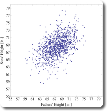
The data for this post was taken from this server at Berkeley, a similar analysis as presented here can be found in this pdf by Michael Wichura. A scatterplot of these pairs of measurements is shown on Figure 1, showing the fathers’ heights along the x-axis, and the corresponding sons’ heights along the y-axis.

Figure 1: Scatterplot of Galton's data-set
Figure 1 shows that the measured humans were around 68 inches tall, which is the range of heights where most dots in the scatterplot occur. The point-cloud is not circular shaped but like an ellipse, pointing toward the top right. Hence, on average, within the measured population, the taller the fathers are, the taller are their sons.
Fair enough, generally, tall fathers have tall sons. But are the sons taller than the fathers? If yes, then by how much? To answer this question, let’s look a bit closer, beginning at some basic measures of descriptive statistics, then let’s look at some classic regression analysis results.
Descriptive Statistics
The few results of some basic calculations of data-analysis are presented in Table 1. Those results prove in little more detail what we have seen by the first glimpse on Figure 1:
- fathers and sons actually are around 68 inches tall
- on average, sons tend to be a little (0.99 inches) taller than their fathers.
| mean | std. dev. | min | max | |
|---|---|---|---|---|
| fathers | 67.69 | 2.74 | 59.00 | 75.43 |
| sons | 68.68 | 2.81 | 58.51 | 78.36 |
Note that the range for sons (19.85 inches) is bigger than for fathers (16.43 inches).
Regression
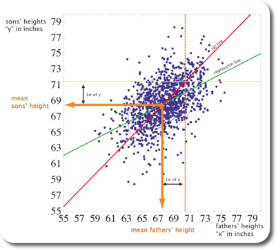
For the upcoming analysis, let’s call sons’ hight y and fathers’ heights x. Figure 3 summarizes the key results. A classic linear regression line is shown in solid blue and solid green. Both lines are identical, the difference here is that the blue line is calculated by an intrinsic function in Mathematica; the green line is numerically calculated:
$$ r = \frac{s_{xy}}{s_{x} s_{y}}\ m = \frac{s_{xz}}{s_{x}^{2}} $$
where $$r$$ is the correlation coefficient and it has a value of 0.51; $$s_{xy}$$ the covariance and $$s_{x}$$ and $$s_{y}$$ the standard deviations of x and y, respectively. The equation for the regression line is then given by:
$$ y = 0.51 \cdot x + 33.89 $$
Both the green and the blue line go through the point $$( \bar{x}, \bar{y} ) $$. Its slope m can be calculated by combining the first two equations:
$$ m = r \cdot \frac{S_{y}}{S_{x}} $$
Figure 3 shows a third solid line, coloured in red, which is pointing into a similar direction as the green/blue line and which is also going through $$( \bar{x}, \bar{y} ) $$. However, the slope of the red line is with 0.98 very close to 1.0. The calculation of the slope of the red line is very similar to the procedure for the green/blue line, except that Sign(r) is taken instead of r. Even more, $$s_{x} \sim s_{y}$$, resulting in a slope of about 1.0. The red line is also called “SD line” because it goes through multiples of the standard deviations away from the mean, both for x and y.
Now, what really is the difference between both lines? The fathers who are one standard deviation above the average fathers’ height are plotted on the orange dashed line. Similarly, the sons who are one standard deviation above average sons’ height are plotted on the yellow dashed lines. Both dashed lines intersect as expected on the red SD line. However, most of the points along the orange dashed line are below the yellow dashed line (see also Figure 3). In other words, most of the sons whose fathers were one standard deviation above average fathers height were quite a bit smaller than than one standard deviation above average sons’ height. This is where the correlation r of ~0.5 comes in place. Associated with an increase of one standard deviation in fathers’ height is an increase of only 0.5 standard deviations of sons’ height, on average. That point is exactly where the green solid line intersects the orange dashed line, on the regression line. This also means that for an r of about 1, the SDLine and the regression line would be identical.

Figure 2: Classical regression line and SDline shown on the scatterplot fo Figure 1.
Let’s try and shed some more light into the relation between r, the regression line, and the SDline. Let’s pretend we are moving along the orange dashed line in Figure 2 and while we’re moving, we count how many dots we pass and what the corresponding y value is. When we’re done we plot the “collected” data on a histogram, shown on Figure 3. It turns out, that about half the points we encounter are below 70.1, indicated by the green line. 70.1 is the value of the regression line at 1SD to the right of $$ \bar{x}$$. The intersection with the regression line occurs at ~71.5, which is $$ r \cdot s_{y} $$ higher than 70.1.
![Histogram along x=1SD to the right of mean[x] histogram along a line indicated by 1SD to the right of the mean of the x-values (dashed orange line). The dashed line and the orange line indicate the locations where the regression line (green) and the SDline (red) intersect with the dashed orange line](http://www.planetwater.org/wp-content/images/Galton_Histogram.jpg)
Histogram parallel to the y-axis of Figure 2, along a line indicated by 1SD to the right of the mean of the x-values (dashed orange line). The dashed line and the orange line indicate the locations where the regression line (green) and the SDline (red) intersect with the dashed orange line
Conclusion
The regression line is a linear least squares fit to your data. As Freedman puts it: “Among all lines, the regression line for y on x makes the smallest root mean square error in predicting y from x”. For each change of one SD in x direction, the regression line changes in y direction by $$ r * s_{y} $$. The SDline can be used as a different summary statistics of the scatterplot.
It remains to point out
- that the concept of regression works only for linear relationships!
- that under all circumstances you should think first very carefully, if the two variables that you are using for regression are the ones that are really related!
In the next post, I will do a very similar analysis with some real meteorological data. You can access the mathematica v.7 notebook that I used for this post here.