Archive for the ‘teaching’ tag
Cool Experiment with Glass Beads
Science is fun! It is fun, because things can emerge. Things that were not anticipated. It might be that the information of the things that eventually emerged has been there before you started, but you were not aware of it.
To this day things can emerge and there is no explanation. In these cases, experiments are not done to prove or to refute something, but because of fun. I am convinced this works in most fields. And it works even today, where it might seem that in some fields everything is found out. It works with “material experiments” such as this one where Frank Rietz played with glass beads. It can be in statistics, when you “play around” with a given data-set, and probably it can happen in any discipline. To a great deal, this is why I think science is fun!
Now, sit back, and watch this, and be amazed! 🙂
What is the Probability
I would like to point you to a fairly new webpage: The book of odds.
It’s fairly easy to guess [sic!], what this page is about:
Book of Odds is the world’s first reference on the odds of everyday life. It is a destination where people come to learn about the things that worry or excite them, to read engaging and thoughtful articles, and to participate in a community of users that share their interests and ambitions.
The founders of this page collected information for a couple of years, evaluated that data, and put the resulting statistics on their webpage. Some of them are funny, some are interesting, some are a little old. For sure, the page is interesting to check out!
It remains to remember what odds are: the odds of an event is the ratio of the event’s probability to occur to the complementary probability. An example:
The odds that a wildfire will be started by humans are 1 in 1.18 (85%). This means that about 85% of wildfires are started, intentionally or accidentally, by people
This means, 85% is the ratio of the numbers of wildfires started by humans and the number of total wildfires (in a given area over a given time, none of which is unfortunately directly mentioned in this article at the book of odds) is 100/118.
Regression 102 (Mathematica, Meteorological Data)
The NUPUS conference is over, the first snow of the year has fallen, a good friend is married — now I have finally some time to continue with some examples related to regression and actual weather data. I have promised that since quite a while now. Sorry!
In the first post of this mini-series on regression I looked at some basic properties of traditional regression analysis. Today I will look at two real-world examples of meteorological data and apply some of the methods of the first post. I will use some of the features introduced in Mathematica version 7 for plotting meteorological as well as spatial data. I think you can find a really great introduction at the Mathematica Blog as well as at the mathematica help-site. In the next post, I will look at some disadvantages of traditional regression analysis.
The novel features of mathematica make it fairly easy to look at the daily mean air temperatures in Munich and in Frankfurt (Figure 1). Since the two cities are located fairly close to each other, their daily mean temperatures are fairly similar. The orange dots which indicate Frankfurt are roughly at the same location in the scatter-plot as the black dots which indicate Munich.
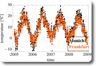
Figure 1: Daily mean air temperature in Munich and Frankfurt over time
It gets a little bit trickier, if we want to look at a different kind of scatter-plot: not at a time-series as in Figure 1 but at a scatter-plot similar to the heights of the pairs of fathers and sons (Figure 1 in the previous post, for example). Ulises at Wolfram, one of the two authors of the Weather Patterns Blog Post at the Wolfram Blog, was so kind to write a wicked little filter for that purpose, which I am sharing in the mathematica workbooks for this post (see links at the end of the post). This filter involves the Mathematica functions Intersection and Alternatives. As we have seen on Figure 1, at the same date the mean air temperature at both cities is fairly similar, three things can be expected:
- the scatterplot is expected to point upwards
- the point-cloud is expected to be narrowly confined (in contrast to the corresponding figure (Figure 1) in the case of Galton’s fathers- and sons- heights)
- the means for Munich and Frankfurt are expected to be similar
All the expectations are met, as shown on Figure 2. Additionally, the regression line and the SD line are almost identical, which is due to the fact that the correlation coefficient r is very close to 1.
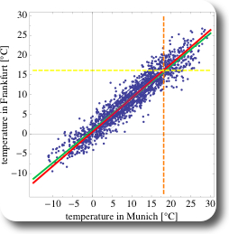
Figure 2: Scatter-plot of pairs of daily mean air temperature in Munich and in Frankfurt, Germany
As a second example, let’s compare the daily mean air temperatures in Munich and in Cape Town, South Africa (Figure 3). Since both cities are on different hemispheres, annual cycle of temperatures are phase shifted by half a year. Additionally, the range of encountered temperatures is smaller than in Munich, and always above zero in Cape Town. The corresponding scatter-plot is shown on Figure 4. Due to the phase shift, the correlation is negative and the cloud of the points of the scatter-plot is pointing towards the bottom right of the chart.
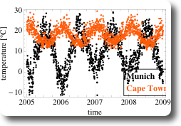
Figure 3: Daily mean air temperature in Munich and Cape Town over time
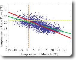
Figure 4: Scatter-plot of pairs of daily mean air temperature in Munich and in Cape Town, Germany
What are the differences between the two data-sets using data from Munich-Frankfurt and from Munich-Cape Town?
- if the temperature in Munich is high, then the temperature in Frankfurt is also high (and vice versa), hence there is a positive correlation in temperature in Munich and in Frankfurt: $$r = 0.95$$.
- if the temperature in Munich is high, then the temperature in Cape Town is low (and vice versa), hence there is a negative correlation in temperature in Munich and in Capetown: $$r= -0.66$$
- the correlation between Munich and Frankfurt is stronger than between Munich and Cape Town. This is also the reason, why the SD line and the regression line are more similar in the case of Munich and Frankfurt than in the second data-set.
Here are the links to the Mathematica workbooks for this post:
- for the data-set Munich and Frankfurt
- for the data-set Munich and Capetown
In the next post, I will look at some of the properties of this regression analysis.
Regression 101 (SD line, statistics)
It is not a hidden fact that I work in geostatistics. More specific, I try to use copulas to model fields of spatially distributed parameters by mathematically describing their dependence structure. I set out to shed some light into what this all means, or what I understand of it, by writing a series of blog posts on planetwater.org.
In this first post I am going to try and explain a very basic tool of traditional statistics: regression. In future posts I am going to try and explain more topics with the goal to describe how copulas can work in spatial statistics. Today, I am going to use the classic Galton data-set of pairwise measurements of the heights of 1078 fathers and their sons. In the next post I am trying to show some of these concept using some current meteorological data.
Granted, some aspects of the analysis are adapted based on the classic book “Statistics” by Freedman.
Here’s what wikipedia has to say about the Galton data-set:
Pearson was instrumental in the development of this theory. One of his classic data sets (originally collected by Galton) involves the regression of sons’ height upon that of their fathers’.
The data for this post was taken from this server at Berkeley, a similar analysis as presented here can be found in this pdf by Michael Wichura. A scatterplot of these pairs of measurements is shown on Figure 1, showing the fathers’ heights along the x-axis, and the corresponding sons’ heights along the y-axis.
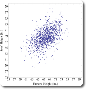
Figure 1: Scatterplot of Galton's data-set
Figure 1 shows that the measured humans were around 68 inches tall, which is the range of heights where most dots in the scatterplot occur. The point-cloud is not circular shaped but like an ellipse, pointing toward the top right. Hence, on average, within the measured population, the taller the fathers are, the taller are their sons.
Fair enough, generally, tall fathers have tall sons. But are the sons taller than the fathers? If yes, then by how much? To answer this question, let’s look a bit closer, beginning at some basic measures of descriptive statistics, then let’s look at some classic regression analysis results.
Descriptive Statistics
The few results of some basic calculations of data-analysis are presented in Table 1. Those results prove in little more detail what we have seen by the first glimpse on Figure 1:
- fathers and sons actually are around 68 inches tall
- on average, sons tend to be a little (0.99 inches) taller than their fathers.
| mean | std. dev. | min | max | |
|---|---|---|---|---|
| fathers | 67.69 | 2.74 | 59.00 | 75.43 |
| sons | 68.68 | 2.81 | 58.51 | 78.36 |
Note that the range for sons (19.85 inches) is bigger than for fathers (16.43 inches).
Regression
For the upcoming analysis, let’s call sons’ hight y and fathers’ heights x. Figure 3 summarizes the key results. A classic linear regression line is shown in solid blue and solid green. Both lines are identical, the difference here is that the blue line is calculated by an intrinsic function in Mathematica; the green line is numerically calculated:
$$ r = \frac{s_{xy}}{s_{x} s_{y}}\ m = \frac{s_{xz}}{s_{x}^{2}} $$
where $$r$$ is the correlation coefficient and it has a value of 0.51; $$s_{xy}$$ the covariance and $$s_{x}$$ and $$s_{y}$$ the standard deviations of x and y, respectively. The equation for the regression line is then given by:
$$ y = 0.51 \cdot x + 33.89 $$
Both the green and the blue line go through the point $$( \bar{x}, \bar{y} ) $$. Its slope m can be calculated by combining the first two equations:
$$ m = r \cdot \frac{S_{y}}{S_{x}} $$
Figure 3 shows a third solid line, coloured in red, which is pointing into a similar direction as the green/blue line and which is also going through $$( \bar{x}, \bar{y} ) $$. However, the slope of the red line is with 0.98 very close to 1.0. The calculation of the slope of the red line is very similar to the procedure for the green/blue line, except that Sign(r) is taken instead of r. Even more, $$s_{x} \sim s_{y}$$, resulting in a slope of about 1.0. The red line is also called “SD line” because it goes through multiples of the standard deviations away from the mean, both for x and y.
Now, what really is the difference between both lines? The fathers who are one standard deviation above the average fathers’ height are plotted on the orange dashed line. Similarly, the sons who are one standard deviation above average sons’ height are plotted on the yellow dashed lines. Both dashed lines intersect as expected on the red SD line. However, most of the points along the orange dashed line are below the yellow dashed line (see also Figure 3). In other words, most of the sons whose fathers were one standard deviation above average fathers height were quite a bit smaller than than one standard deviation above average sons’ height. This is where the correlation r of ~0.5 comes in place. Associated with an increase of one standard deviation in fathers’ height is an increase of only 0.5 standard deviations of sons’ height, on average. That point is exactly where the green solid line intersects the orange dashed line, on the regression line. This also means that for an r of about 1, the SDLine and the regression line would be identical.
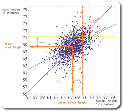
Figure 2: Classical regression line and SDline shown on the scatterplot fo Figure 1.
Let’s try and shed some more light into the relation between r, the regression line, and the SDline. Let’s pretend we are moving along the orange dashed line in Figure 2 and while we’re moving, we count how many dots we pass and what the corresponding y value is. When we’re done we plot the “collected” data on a histogram, shown on Figure 3. It turns out, that about half the points we encounter are below 70.1, indicated by the green line. 70.1 is the value of the regression line at 1SD to the right of $$ \bar{x}$$. The intersection with the regression line occurs at ~71.5, which is $$ r \cdot s_{y} $$ higher than 70.1.
![Histogram along x=1SD to the right of mean[x] histogram along a line indicated by 1SD to the right of the mean of the x-values (dashed orange line). The dashed line and the orange line indicate the locations where the regression line (green) and the SDline (red) intersect with the dashed orange line](http://www.planetwater.org/wp-content/images/Galton_Histogram.jpg)
Histogram parallel to the y-axis of Figure 2, along a line indicated by 1SD to the right of the mean of the x-values (dashed orange line). The dashed line and the orange line indicate the locations where the regression line (green) and the SDline (red) intersect with the dashed orange line
Conclusion
The regression line is a linear least squares fit to your data. As Freedman puts it: “Among all lines, the regression line for y on x makes the smallest root mean square error in predicting y from x”. For each change of one SD in x direction, the regression line changes in y direction by $$ r * s_{y} $$. The SDline can be used as a different summary statistics of the scatterplot.
It remains to point out
- that the concept of regression works only for linear relationships!
- that under all circumstances you should think first very carefully, if the two variables that you are using for regression are the ones that are really related!
In the next post, I will do a very similar analysis with some real meteorological data. You can access the mathematica v.7 notebook that I used for this post here.