Archive for the ‘Statistics’ tag
Crisp and Interval-Based Conditional Probabilities
“Censored data” is the common statistical term for values that are within an interval. A typical example from environmental data-sets are measurements below a certain detection limit. If a measurement is below detection limit, due to the analytical performance of the device that measures the concentration, we don’t know its precise value, but we do know that it is somewhere in the interval \[\smash{\in(0, \textnormal{detection limit})}\].
Application in Environmental Hydrology
A typical example where censored measurements play an important role are solute concentrations in groundwater. The measured concentration value of some solute depends on the analytical method that was used for quantification of the concentration. Sometimes, the concentration is so small that we can not be certain about it’s value, and we assume that the true value is somewhere between zero and the analytical detection limit.
In a recent example, my coauthors and I demonstrated the importance of including censored measurements to derive a representative concentration of chlorinated solutes in a hydrogeological layer at two boreholes within a fractured sandstone. Due to the fractured nature of the sandstone, at most depths the concentrations were fairly small and frequently below detection limit, whereas in the fractures, typically large concentrations were encountered. Taking the censored measurements (the concentrations below detection limit) in a statistical meaningful way into account lead to an estimate of representative concentrations that corresponded to the conceptual site hydrogeological model at the upstream and downstream borehole, and can be important for site assessment.
Related to censored measurements, but different, are true zeros. An example of a measurement of true zero is a rain gauge that measures precipitation when it does not rain. The distinction between a true zero and a measurement below detection limit can be tricky, because they are both small values. If you’re interested in how to include true zeros in this approach, please continue to read here. A truely zero measurement means that its value is zero and not in an interval between zero and the detection limit.
If you are interested in a statistically reasonable treatment of censored measurements, you can find the related publication in Environmental Science and Technology.
I’ll explain the basic underlying theory below.
Basic Statistics Example
I have written about conditional_probabilities quite some time ago. This can be viewed as an extension.
A crisp condition is something like “what is the probability of event A to occur, given event B has occurred”. This is how conditional probabilities are typically taught with. Compared to a univariate density, a conditional density should have a smaller variance, and is shifted towards the condition. So far so good.
It turns out that there is a “not-crisp” condition. This is something like “probability of event A given that ‘event’ B is somewhere between zero and b”. The funny thing is, that the uncertainty about this event to occur is smaller than a corresponding normally-distributed univariate event.
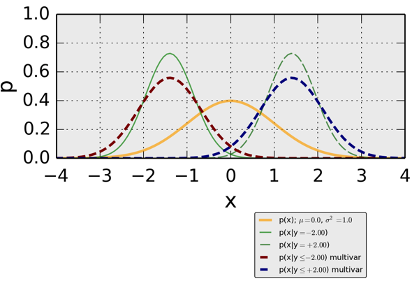
When looking at the figure below, this means:
- the yellow line indicates a standard (variance=1) normal Gaussian density
- two crisp conditional densities are shown by the solid (\[p(x|y=-2.0)\]) and the dashed (\[p(x|y=+2.0)\]). Both those densities have a smaller uncertainty (variance) than the univariate standard normal
- two interval-based conditional densities are shown in red (\[p(x|y \leq -2.0)\]) and blue (\[p(x|y \leq +2.0)\]). The interval-based densities have the same location as the crisp conditionals. Their uncertainties are smaller than the corresponding univariate, but larger than the crisp conditionals.
Magnitudes of Extreme Weather Events
The invention what we now call insurance was a big step in human development: People who potentially suffer from losses due to the same reason pay money into a pot. When somebody experiences such a loss gets, he gets money from the pot, and more money than he puts in on a regular basis.
Things get problematic, when losses occur more frequently than expected or are more severe and lead to more severe losses than expected. Then there is not enough money in the pot. This could happen either because the expected frequency or severity were estimated wrong, or because the underlying process that causes the losses has changed.
In one of the stories Kaiser Fung describes how there is not enough money in the pot for people who suffer from storms in Florida. I think when dealing with the magnitude of extreme events, especial care has to be spent on the way of “statistical thinking”, hence I’d like to expand on this topic a little bit to Kaiser Fung’s writing.
Generally, the severity of storms is measured by the “return period”. This is statistically speaking, the number of years that pass on average until a storm of such a severity occurs again.
There are a few problematic things:
- One problem is the “on average” part, because it means the average if we had an infinitely long time series of observations of annual storms. Unfortunately, a really long time-series of measurements of naturally occurring phenomena is 100 years old. The magic of statistics comes into play when we want to estimate the magnitude of a storm with a 100 year return period or even a 1000 year return period.
- Another problem is, that really severe storms can occur in consecutive years. For example, two storms, each with a return-period of about 100 years could occur this year and next year. Generally, the property of storms occurring in consecutive years is covered by the statistics-side, but is generally perceived wrongly in the public.
- Expanding on the last problem: such two really severe storms could even occur both in the same year. Or even more than two storms in one year. This is a property that is covered only in more complex statistical models.
- In doing all of this, in order for statistical models to work, we have to assume that all the storms are “from the same homogeneous population”. This has a couple of implications! For one, every storm is independent of every other storm. This might be ok, if there is only one big storm every year. But what if similar or one set of conditions leads to multiple really big storms? Or what if the underlying process that causes storms, such as the weather patterns off-shore of Florida, change? We base our estimates of a storm with a return period of 100 years on data gathered in the past, and that’s as good as we can do for data collection. But if the underlying process started changing during the last say 20 years and such that the severity of storm generally increases, then our estimates based on our data consistently underestimate the severity of storm.
- Finally, one problem I want to only mention and not go into depth, because it is too deep for this post is the problem of making statements about extreme events in an areal context. Is the severity of a storm with a return period of 100 years the same everywhere in Florida? Everywhere in the USA? Everywhere in the world?
A novel concept for me about which Kaiser Fung wrote is that storms are can be classified differently: Not according to the return period in terms of severity of the natural phenomenon, measured for example by wind speed, but according to the economic loss they cause. This doesn’t solve the problems outlined above, but is at least an interesting different yardstick.
Book Review: “Numbers Rule Your World” by Kaiser Fung
I am working in a statistically inclined workgroup at the University of Stuttgart, hence the title of the book naturally attracted me. Kaiser Fung tells stories in five chapters in his book “Numbers Rule Your World: The Hidden Influence of Probabilities and Statistics on Everything You Do”
on the daily use of statistics. By “daily use” I mean the use in settings or for cases that are directly applicable or even influence our daily lives.
What are examples of such stories? People across the USA got sick, and it was unclear why. How do you find out what the source of the illness is? How can you find out, that the source was one spinach field in California? If you live in a city, and you rely daily on driving cars to get to work, you would be quite happy to know that somebody is making sure that your travel time is as short as possible, right? How is that travel time minimized?
When teaching statistics or subjects with statistical basis, I find that newcomers to the field of statistics, or even people who don’t use statistics on a regular basis are not used to “statistical thinking”. This lack of use or lack of being used to frequently results in hesitation against using or even in refuse to use statistics. Hence I think hearing about those very applied stories helps a lot for getting used to statistics. “Statistical Thinking” is a term actually used by Kaiser Fung when he explains why he wanted to tell these stories.
Particularly, there are two topics that play a significant role in Kaiser Fung’s stories which I want to expand on in two upcoming posts:
- what problems arise when dealing with magnitudes of extreme (weather) events
- statistical testing tends to be an unliked topic, but one of Kaiser Fung’s stories puts a current and rather interesting perspective onto testing: how do you find out if somebody has used substances that increase his or her physical ability when doing sports. Especially, Kaiser Fung explained in great depth the issues of “false positives” and “false negatives”.
Before I will expand on these two issues, let me tell you that I really loved reading those stories. They are well written, I think well understandable for somebody who is not experienced or even trained in “statistical thinking”. Finally, a big plus is a longer than normal “conclusions” section, where Kaiser Fung tries to put the underlying basic thoughts of each story into almost all the other stories’ context.
Cool Stories About Numbers by Steven Strogatz
I mentioned a little while ago that Steve Strogatz’s has started a series of posts on numbers. By now, Steve has published six sequels. Every one of his posts explains in a very understandable manner either seemingly simple or seemingly complex issues related to numbers. They are very joyful and entertaining reads.
- “From Fish to Infinity” — what are numbers, counting, great Seseame Street video
“Rock Groups” — odd numbers can form L-shapes

uneven numbers can form L-Shapes
“The Enemy of My Enemy” — making peace with negative numbers
- “Division and Its Discontents” — fun with fractions, decimals and numbers like 0.12122122212222…
around here Steve moves from grade school arithmetic to high school math
- “The Joy of X” — “…in the end they all boil down to just two activities — solving for x and working with formulas.” … and always check for the units!
- “Finding Your Roots” — the square root of -1; complex numbers have all the properties as real numbers […], but they are better than real numbers, because they always have roots; a flip of 180 degrees can happen by multiplying twice with i or by multiplying with -1, so $$i^{2}=-1$$; fractals
Update Saturday; March 13, 2010:
Seedmagazine just published an interview with Steven Strogatz. The occasion of the interview was a book recently published by Strogatz: The Calculus of Friendship: What a Teacher and a Student Learned about Life While Corresponding about Math
Monads
The Universe of Discourse pointed me to “Mondas”. Before, I had no idea, what Monads are. Likely, I still don’t have a clue, but I did like this wicked analogy: Monads are like burritos. When I continued reading the Universe of Disclosure, I learned that probability distributions form Monads. Which is where I saw the first time what turned out to be Haskell code (I think). Finally, the Universe of Discourse provides a bibliography of probability Monads.
This is why blogging is cool.
Getting Ready for AGU Fall Meeting
Folks, I am getting ready for the AGU Fall conference, which starts tomorrow (Sunday) evening in San Francisco. I’ve never been to a scientific conference of that size, so I am very curious. I was browsing through the online database of talks and presentations, and it’s just mind-boggling.
Poster
My poster’s title is “Effects of Non-Gaussian Spatial Dependence of Hydraulic Conductivity on Hydrodynamic Macrodispersion”. Its ID is H43F-1093 and it will be presented on Thursday, Dec 17, starting at 1:40 PM in the Poster Hall (Moscone South). Come and drop by! It’s nice to meet blog-readers in person!
Copulas
The key method I am using are spatial copulas. I had set out to explain what this is on this blog here and here, but I have never gotten around to get really to what copulas are. I promise I will continue to write here about copulas as soon as I am back.
Geo-Bloggers
There is going to be a meeting of geo-bloggers on Wednesday! Some cool resources do exist already:
- a list online of who is registered
- a shared google.doc from @Boreholegroup of geo-bloggers who present their scientific work at AGU.
- a twitter list by @Allochthonous
I am looking forward to the show! 🙂
Design
This is the story of a designer, who worked at google. He explains how design at google is extremely data driven.
Yes, it’s true that a team at Google couldn’t decide between two blues, so they’re testing 41 shades between each blue to see which one performs better. I had a recent debate over whether a border should be 3, 4 or 5 pixels wide, and was asked to prove my case.
Picking up the google story, Scott Stevenson argues in this mini-pamphlet how important designers’ judgments in software design are.
How does this relate to planetwater.org or my work? I am obviously not mainly in software design. What I have done recently is I have been going through a lot of iterations of one problem with a master’s level student of mine. It has been a lot of fun at times and it has been frustrating at times. We could have tackled the problem by “just do it”. However, we took a lot of paths away from the main path, and we did learn a lot. Maybe it was not the most direct way, maybe we also created a lot of “failures”, maybe we could have been quicker. We did learn a lot, and our end-result is very good.
It remains, generally, that the boundary between design, statistics, environmental modelling, and even art is very interesting. It might be an art by itself. And dreaming is a big part of it.
Cool Experiment with Glass Beads
Science is fun! It is fun, because things can emerge. Things that were not anticipated. It might be that the information of the things that eventually emerged has been there before you started, but you were not aware of it.
To this day things can emerge and there is no explanation. In these cases, experiments are not done to prove or to refute something, but because of fun. I am convinced this works in most fields. And it works even today, where it might seem that in some fields everything is found out. It works with “material experiments” such as this one where Frank Rietz played with glass beads. It can be in statistics, when you “play around” with a given data-set, and probably it can happen in any discipline. To a great deal, this is why I think science is fun!
Now, sit back, and watch this, and be amazed! 🙂
What is the Probability
I would like to point you to a fairly new webpage: The book of odds.
It’s fairly easy to guess [sic!], what this page is about:
Book of Odds is the world’s first reference on the odds of everyday life. It is a destination where people come to learn about the things that worry or excite them, to read engaging and thoughtful articles, and to participate in a community of users that share their interests and ambitions.
The founders of this page collected information for a couple of years, evaluated that data, and put the resulting statistics on their webpage. Some of them are funny, some are interesting, some are a little old. For sure, the page is interesting to check out!
It remains to remember what odds are: the odds of an event is the ratio of the event’s probability to occur to the complementary probability. An example:
The odds that a wildfire will be started by humans are 1 in 1.18 (85%). This means that about 85% of wildfires are started, intentionally or accidentally, by people
This means, 85% is the ratio of the numbers of wildfires started by humans and the number of total wildfires (in a given area over a given time, none of which is unfortunately directly mentioned in this article at the book of odds) is 100/118.
Regression 102 (Mathematica, Meteorological Data)
The NUPUS conference is over, the first snow of the year has fallen, a good friend is married — now I have finally some time to continue with some examples related to regression and actual weather data. I have promised that since quite a while now. Sorry!
In the first post of this mini-series on regression I looked at some basic properties of traditional regression analysis. Today I will look at two real-world examples of meteorological data and apply some of the methods of the first post. I will use some of the features introduced in Mathematica version 7 for plotting meteorological as well as spatial data. I think you can find a really great introduction at the Mathematica Blog as well as at the mathematica help-site. In the next post, I will look at some disadvantages of traditional regression analysis.
The novel features of mathematica make it fairly easy to look at the daily mean air temperatures in Munich and in Frankfurt (Figure 1). Since the two cities are located fairly close to each other, their daily mean temperatures are fairly similar. The orange dots which indicate Frankfurt are roughly at the same location in the scatter-plot as the black dots which indicate Munich.
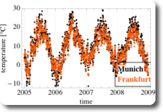
Figure 1: Daily mean air temperature in Munich and Frankfurt over time
It gets a little bit trickier, if we want to look at a different kind of scatter-plot: not at a time-series as in Figure 1 but at a scatter-plot similar to the heights of the pairs of fathers and sons (Figure 1 in the previous post, for example). Ulises at Wolfram, one of the two authors of the Weather Patterns Blog Post at the Wolfram Blog, was so kind to write a wicked little filter for that purpose, which I am sharing in the mathematica workbooks for this post (see links at the end of the post). This filter involves the Mathematica functions Intersection and Alternatives. As we have seen on Figure 1, at the same date the mean air temperature at both cities is fairly similar, three things can be expected:
- the scatterplot is expected to point upwards
- the point-cloud is expected to be narrowly confined (in contrast to the corresponding figure (Figure 1) in the case of Galton’s fathers- and sons- heights)
- the means for Munich and Frankfurt are expected to be similar
All the expectations are met, as shown on Figure 2. Additionally, the regression line and the SD line are almost identical, which is due to the fact that the correlation coefficient r is very close to 1.
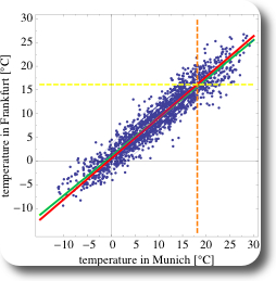
Figure 2: Scatter-plot of pairs of daily mean air temperature in Munich and in Frankfurt, Germany
As a second example, let’s compare the daily mean air temperatures in Munich and in Cape Town, South Africa (Figure 3). Since both cities are on different hemispheres, annual cycle of temperatures are phase shifted by half a year. Additionally, the range of encountered temperatures is smaller than in Munich, and always above zero in Cape Town. The corresponding scatter-plot is shown on Figure 4. Due to the phase shift, the correlation is negative and the cloud of the points of the scatter-plot is pointing towards the bottom right of the chart.
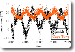
Figure 3: Daily mean air temperature in Munich and Cape Town over time
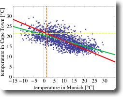
Figure 4: Scatter-plot of pairs of daily mean air temperature in Munich and in Cape Town, Germany
What are the differences between the two data-sets using data from Munich-Frankfurt and from Munich-Cape Town?
- if the temperature in Munich is high, then the temperature in Frankfurt is also high (and vice versa), hence there is a positive correlation in temperature in Munich and in Frankfurt: $$r = 0.95$$.
- if the temperature in Munich is high, then the temperature in Cape Town is low (and vice versa), hence there is a negative correlation in temperature in Munich and in Capetown: $$r= -0.66$$
- the correlation between Munich and Frankfurt is stronger than between Munich and Cape Town. This is also the reason, why the SD line and the regression line are more similar in the case of Munich and Frankfurt than in the second data-set.
Here are the links to the Mathematica workbooks for this post:
- for the data-set Munich and Frankfurt
- for the data-set Munich and Capetown
In the next post, I will look at some of the properties of this regression analysis.
